I. Featured Works
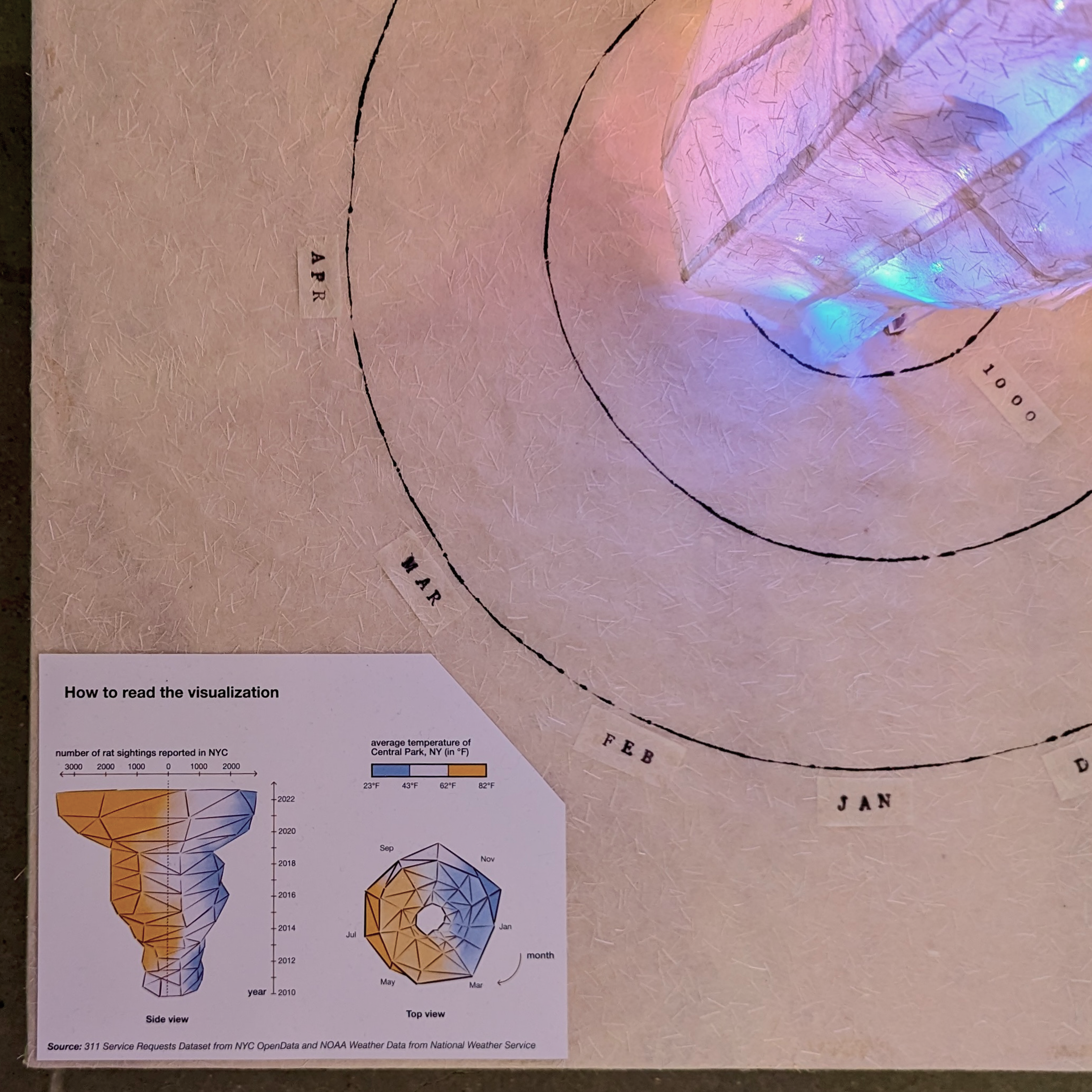
Rat Revolution
A light sculpture visualizing the relationship between NYC rat population and average temperatures.
exhibited at DataxDesign for NYC Open Data Week 2024
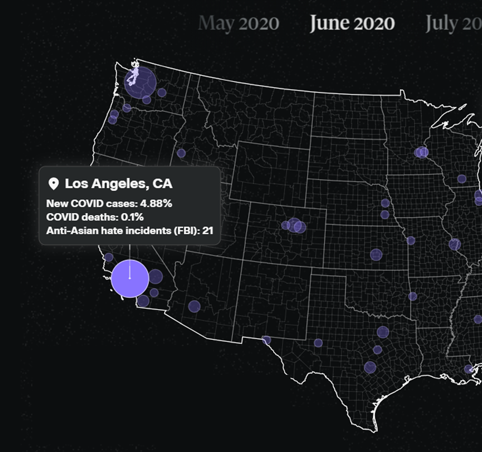
Roots of Racism
Data story examining the conditions for anti Asian hate during COVID-19.
published by The Asian American Foundation
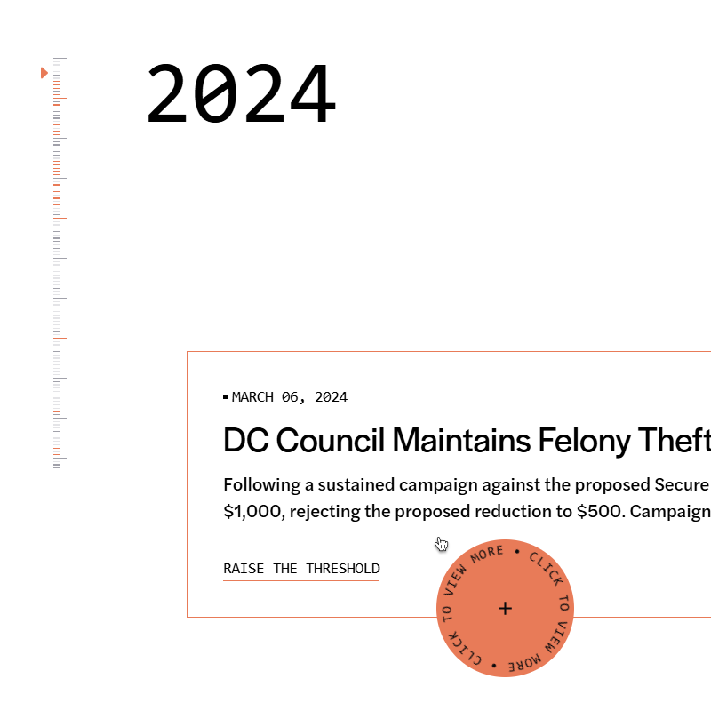
Campaign Zero's 10 Years of Impact
Data-driven interactive timeline of initiatives and news events that have shaped the organization.
published by Campaign Zero
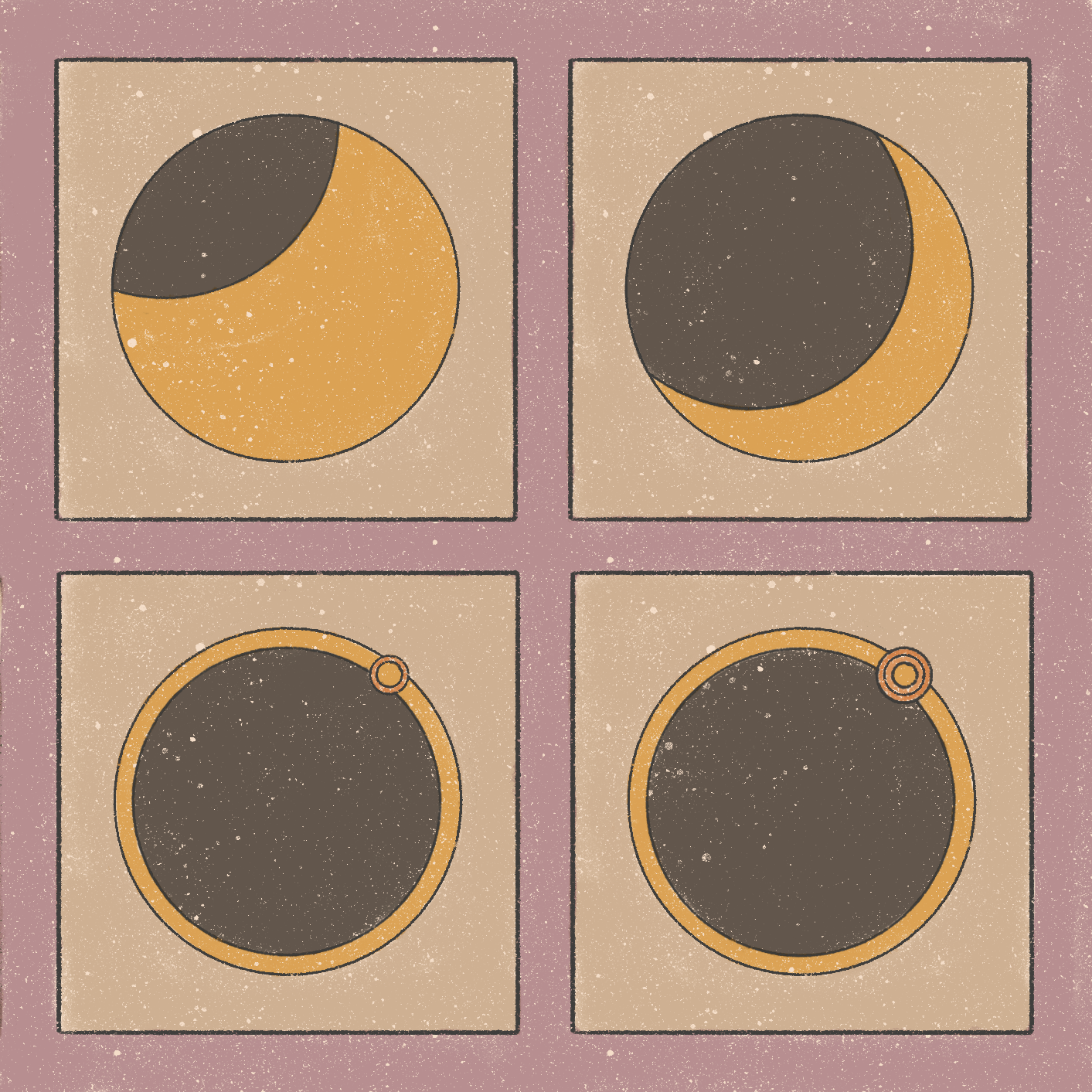
Total Solar Eclipse Explainer
Illustrative explainer about why the total solar eclipse in April 2024 is a rare occurrence.
published in San Antonio Express News, Houston Chronicle, Albany Times Union, more markets to come ...
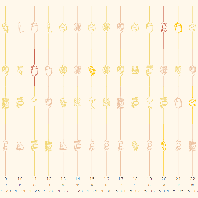
Odyssee
Digital mural on personal experiences and wellbeing during the initial peak of the pandemic, illustrated with 14 interactive data visualizations
featured in Information is Beautiful Awards 2022 Longlist
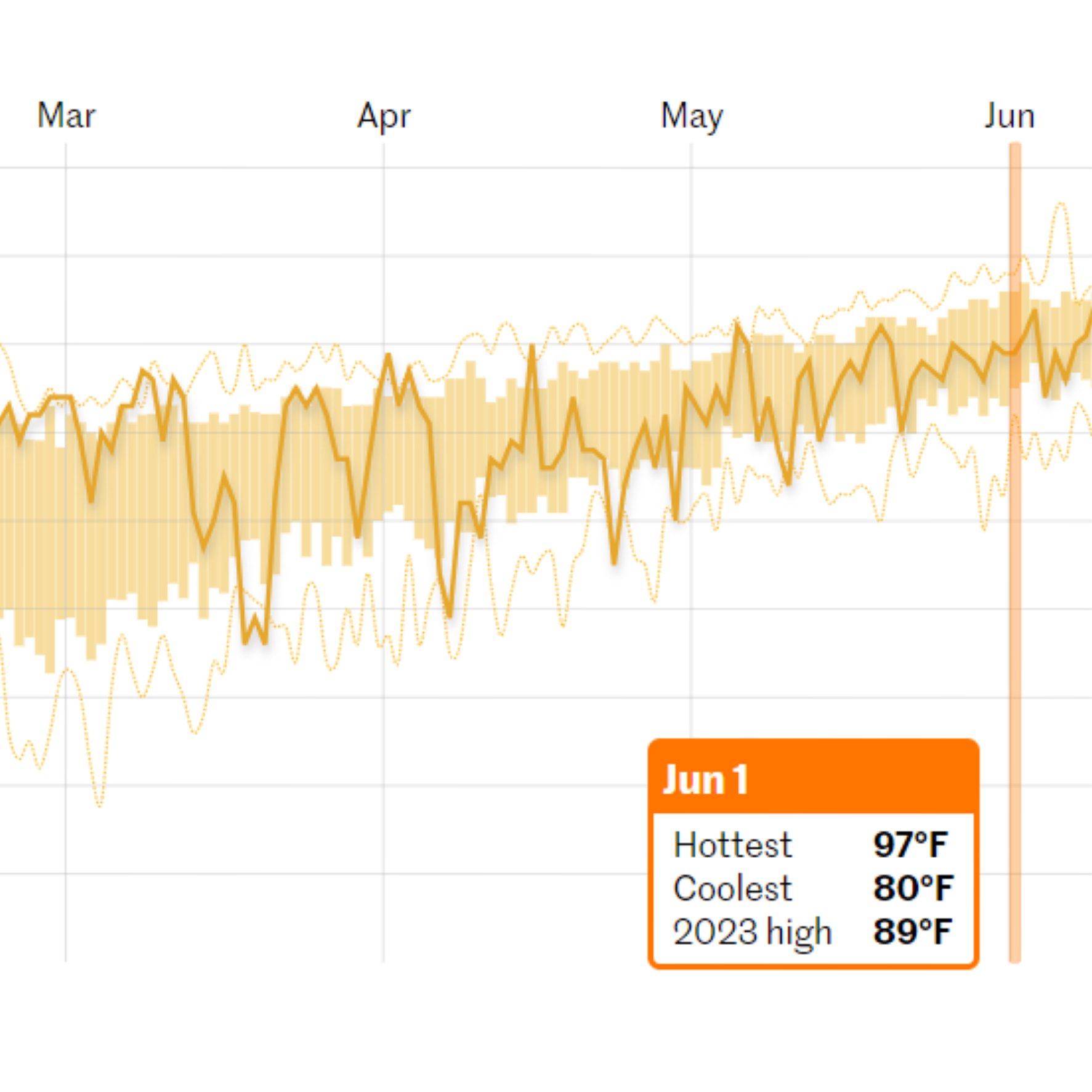
Heat Tracker
Real-time heat tracker for local markets, answering the questions: how hot is it and is the current temperature normal?
II. Microsites
Women's Health Impact Tracking Platform
Data dashboards tracking gaps in women's health, including efficacy, care delivery, and data gaps.
built in collaboration with World Economic Forum, McKinsey Health Institute
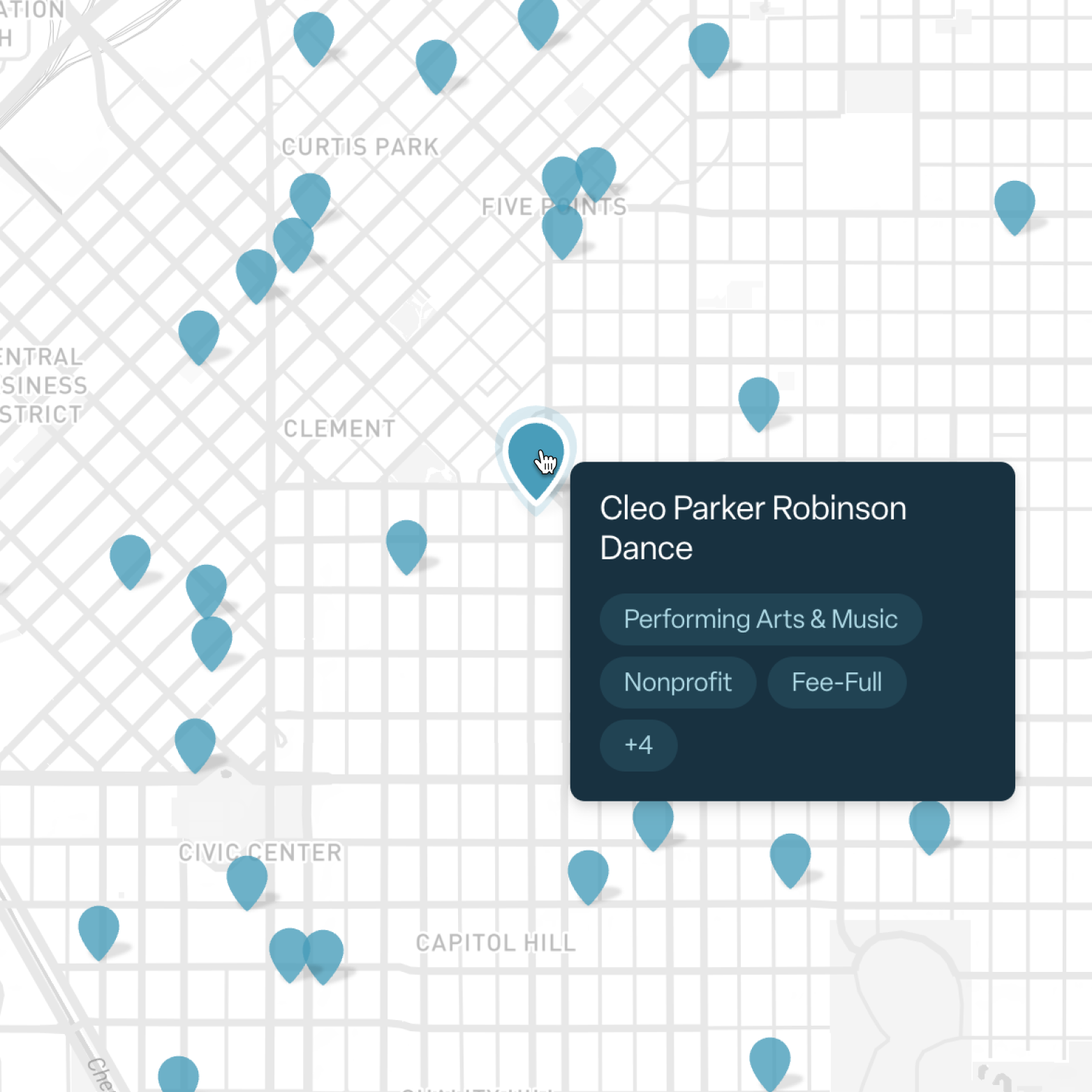
Denver Learning Ecosystem
Map-based dashboards that showcase the out-of-school learning opportunities in Denver, Colorado
built in collaboration with RESCHOOL, Moonshot, Embark Education

Trick or Treat by Instacart
Localized, explorable US map that showcases the top-selling candies and Halloween decors on Instacart's platform
published by Instacart
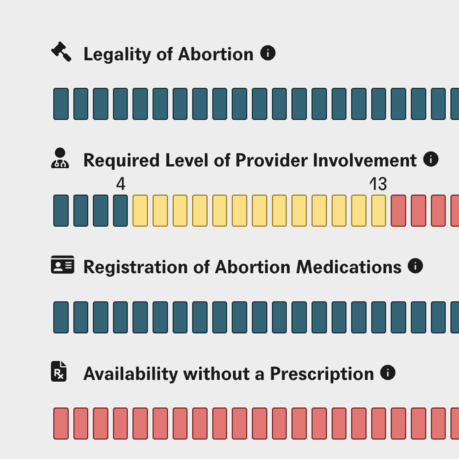
Self-Managed Abortion: The Global Legal Landscape
Data visualization tool that explores the laws and policies impacting self-managed abortion in 39 jurisdictions.
published by Center for Reproductive Rights
III. Data Journalism
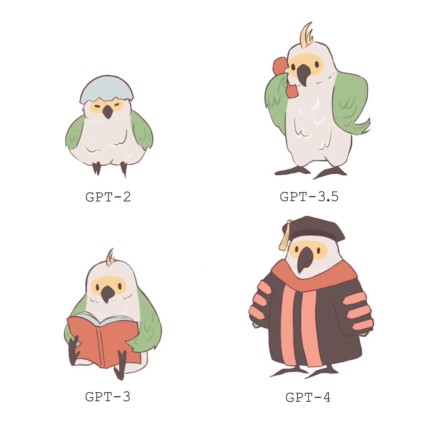
GPT Evolution Explainer
Explainer on limitations across different ChatGPT versions, paired with localized parrot illustrations

FlightAware Delays and Cancellations
Analysis of real-time and historical flight delays and cancellations across several local markets

Is there an afterlife?
Explorable explanation project about a Pew Research Center's study on religion and afterlife
published in Big Think
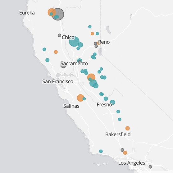
California Reservoir Levels Tracker
An article that explores daily water storage levels of California reservoirs
published in San Francisco Chronicle
IV. Personal Exploration
Perfect Match (2021)
Valentine’s Day matchmaking service that uses machine learning to pair over 5000 Cornell students with their perfect matches
featured in Information is Beautiful Awards 2022 Longlist

Sleep Hygiene: An Intimate View
Reflection of good sleep hygiene habits vs. personal sleep patterns
featured in Information is Beautiful Awards 2022 Longlist

Ludwig's 2021 Subathon
Recap of Ludwig's 31-day subathon that led to him becoming the most subbed streamer on Twitch